The storefront sign is the first impression that attracts customers and serves as a silent ambassador for your brand image.
A great sign = Precise Positioning × Scientific Design × Compliant Construction.
It is recommended to reserve 15% of the total budget as an emergency fund and to simulate the effect three times before production (sunny days, rainy days, and nighttime). Remember: A sign is not a cost but a 24/7 super salesperson.
By carefully selecting materials, designing lighting, and planning the installation layout, you can create a storefront sign that is both aesthetically pleasing and functional, enhancing your brand image and increasing foot traffic.
1. Three Golden Rules for Choosing a Storefront Sign
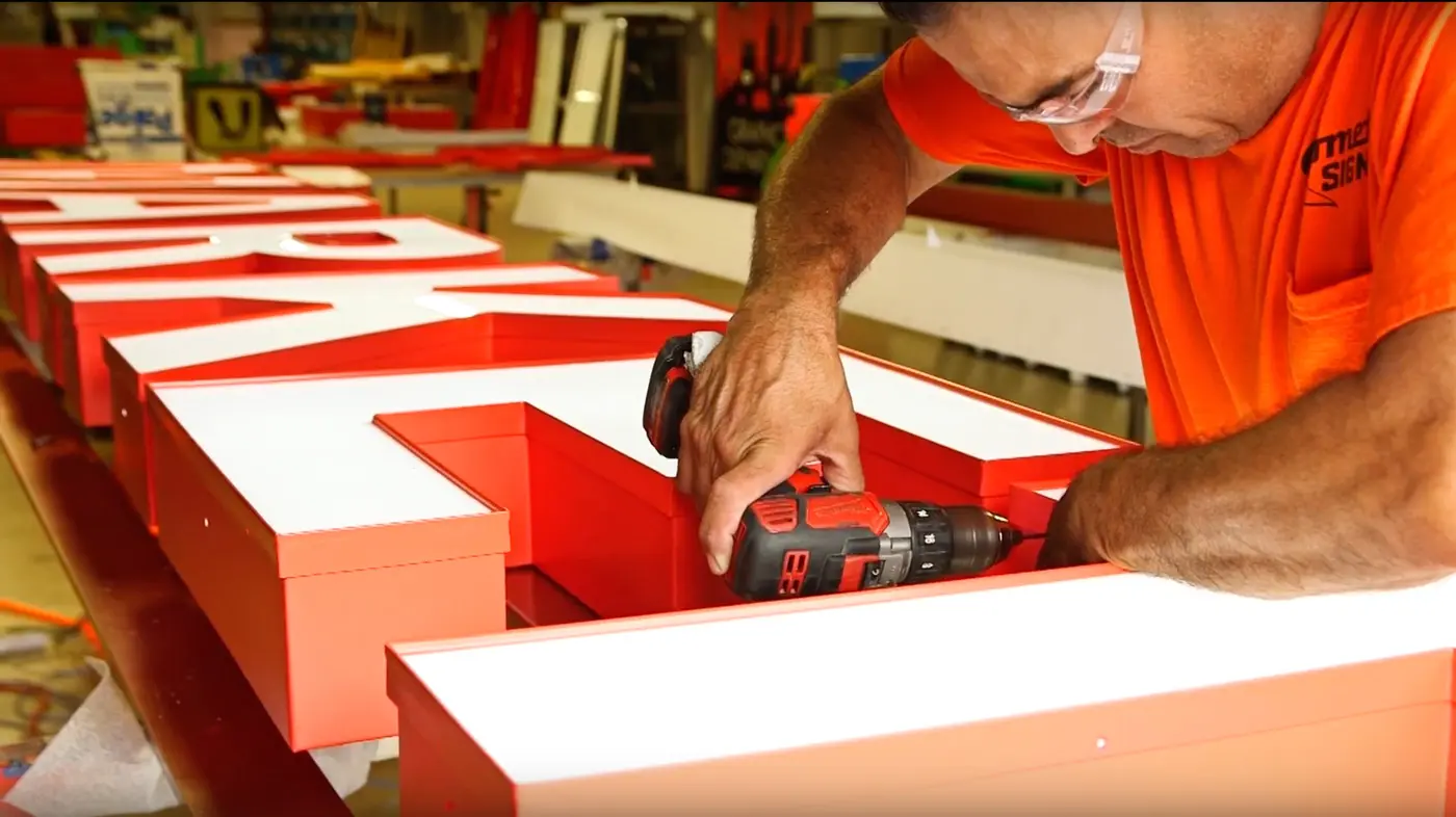
Material Determines Lifespan (With Cost Comparison Table)
| Material Type | Suitable Scenarios | Cost (USD/ sq.ft) | Lifespan | Maintenance Difficulty |
|---|---|---|---|---|
| LED Illuminated Letters | Restaurants/Convenience Stores | 12-22 | 5-8 years | Requires circuit maintenance |
| Acrylic Board | Beauty Salons/Educational Institutions | 4-9 | 3-5 years | Easy to clean |
| Metal Cut-Out Letters | Law Firms/Banks | 18-37 | 10+ years | Rust prevention required |
| Lightbox Fabric | Promotional Events/Pop-Up Stores | 0.7-3 | 1-2 years | Non-repairable |
Recommendation: Restaurants should prioritize dynamic LED signage, educational institutions should opt for acrylic with warm lighting, and financial institutions should use metal 3D letters to convey professionalism.
2. The “3-Second Rule” of Visual Communication
Effective Reading Distance Formula: Font Height (inches) = Visible Distance (feet) × 0.6
(Example: 12-inch font height for 20-foot visibility)Color Combination Taboos: Avoid pure black backgrounds for pharmacies; restaurants should avoid blue tones (appetite suppressant).
Font Psychology: Use sans-serif fonts for tech-related businesses and calligraphy fonts for handmade goods stores.
3. Four-Dimensional Assessment of Installation Environment
Street Width: Choose vertical signage for narrow alleys and horizontal signage for main roads.
Sunlight Direction: Use fade-resistant coatings for west-facing locations.
Competitor Analysis: Adopt differentiated color strategies (e.g., use Tiffany blue when the street is dominated by red signs).
Municipal Regulations: Check local “Outdoor Advertising Management Regulations” in advance.
Industry-Specific Customized Solutions
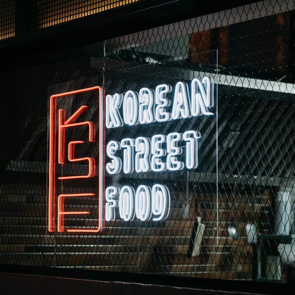
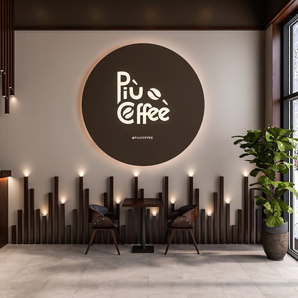
1. Food & Beverage Industry: Eye-Catching and Functional Signage
- Design Tips: Use wooden or metal embossed letters with embedded warm lighting to create a cozy and inviting atmosphere.
- Lighting: Warm light (200 lux) evokes comfort and relaxation.
- Font Choice: Handwritten or script fonts to reflect creativity and individuality.
- Color Scheme: Earthy tones like brown, beige, and soft green enhance the cozy vibe.
- Design Tips: Neon tube signs with elegant cursive lettering (e.g., “Wine & Chill”) or backlit metal signs for a luxurious look.
- Color Scheme: Deep reds, golds, and warm white lighting to complement the upscale ambiance.
- Lighting: Subtle, dimmable lighting to match the evening-focused atmosphere.
- Design Tips: Use pastel-colored signs with embossed letters or chalkboard-style designs for a homemade, artisanal feel.
- Font Choice: Playful, rounded fonts to convey warmth.
- Color Scheme: Pastels like baby pink, soft blue, and cream paired with white or warm light.
2. Retail Industry: Stylish and Functional Designs
- Design Tips: Ultra-thin lightboxes (<8cm thick) with magnetic, interchangeable visuals for seasonal collections.
- Font Choice: Sleek serif or sans-serif fonts to reflect sophistication and modernity.
- Color Scheme: Neutral tones (like black, white, or metallic gold) for high-end boutiques; bold and colorful for casual wear shops.
- Lighting: Soft LED backlighting to highlight the brand name without overwhelming the storefront.
- Design Tips: Stainless steel or brass letters with a polished or matte titanium coating, paired with spotlight arrays (3000K color temperature) to enhance the sparkle of jewelry.
- Font Choice: Serif fonts to convey elegance and luxury.
- Color Scheme: Metallics like gold, silver, and platinum paired with deep blues or blacks.
- Lighting: Use high-contrast spotlighting to make the store logo and jewelry stand out.
- Design Tips: Use translucent onyx-style panels with engraved lettering to create a sophisticated and literary vibe.
- Lighting: Soft, ambient lighting with a color temperature of 4000K to evoke a calm and intellectual atmosphere.
- Font Choice: Serif fonts or classic typewriter-style fonts to reflect tradition and culture.
- Color Scheme: Neutral tones like cream, green, or dark brown to emphasize warmth and knowledge.
3. Service Industry: Building Trust and Professionalism
- Design Tips: Use retro-style neon signs or painted wood with metallic accents to create a vintage or trendy feel.
- Font Choice: Bold, sans-serif fonts for modern barbershops; vintage script lettering for old-school vibes.
- Color Scheme: Monochrome or deep reds and blues for a classic barber look.
- Design Tips: Iridescent gradient films that change color based on viewing angle for a modern, stylish effect.
- Font Choice: Handwritten or artistic fonts to convey femininity and elegance.
- Color Scheme: Soft pinks, golds, and whites for a luxurious and welcoming aesthetic.
- Lighting: Soft LED lighting for a flattering and comfortable visual environment.
- Design Tips: Bold LED-lit signs with dynamic shapes (e.g., weights, running figures) to emphasize energy and vitality.
- Font Choice: Strong, sans-serif fonts to convey strength and reliability.
- Color Scheme: Bright, energizing colors like red, orange, and black to inspire action.
- Lighting: Bright, cool-toned lighting (5000–6000K) for a modern and clean look.
- Design Tips: Backlit acrylic signs with frosted glass effects to exude calmness and serenity.
- Font Choice: Thin, serif fonts or handwritten script to convey elegance and relaxation.
- Color Scheme: Neutral tones like white, beige, and soft green to reflect tranquility.
- Lighting: Warm, dimmable lighting to create a soothing environment.
4. Convenience Stores and Supermarkets: Maximizing Visibility
- Design Tips: Use LED scrolling displays for dynamic promotions, paired with bold, clear lettering for the store name.
- Font Choice: Simple sans-serif fonts for easy readability.
- Color Scheme: Bright, high-contrast colors like red and yellow to draw attention.
- Lighting: High-intensity LED lighting for 24/7 visibility.
- Design Tips: Large-format lightbox signs with clear, bold fonts to ensure visibility from a distance.
- Font Choice: Simple, professional sans-serif fonts for clarity.
- Color Scheme: Use green to evoke freshness, paired with white or yellow for visibility.
- Lighting: Bright, even lighting to create a clean and welcoming appearance.
When selecting a store sign, it is essential to consider industry characteristics, brand identity, store location, materials, lighting effects, and budget. A well-chosen sign can significantly enhance store appeal, attract more customers, and elevate your business to the next level.
